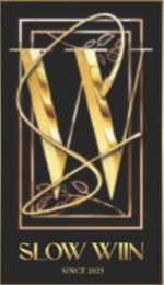
99052284 - SLOW WIIN SINCE 2023.IN ADDITION TO THE BOLD ''W'' IN THE CENTER,THE LOGO FEATURS AN INTRICATELY DESIGNED ''S'' THAT WRAPS AROUND THE ''W'' IN A FLOWING, ELEGANT MANNER.THE ''S'' APPEARS AS A SLENDER, GOLDEN RIBBON-LIKE CURVE, LOOPING GRACEFULLY AROUND THE ''W'' FROM THE TOP RIGHT CORNER DOWN TOWARDS THE BOTTOM LEFT.ITS FLUIDITY CONTRASTS WITH THE MORE ANGULAR, SOLID STRUCTURE OF THE ''W,'' ADDING A SENSE OF MOVEMENT AND HARMONY TO THE OVERALL COMPOSTITION.BEHIND THE ''W,'' BOTH AT THE TOP AND BOTTOM,ARE DELICATE POMEGRANATE BRANCHES,WHICH ARE SUBTLY INCORPORATD INTO THE DESIGN.THESEBRANCHES,RENDERED IN FINE GOLDEN LINES,FEATURE SMALL,STYLIZED LEAVES THAT FRAME THE ''W'' AND ''S'' WITHOUT OVERPOWERING THEM. THE UPPER BRANCH IS POSITIONED JUST ABOVE THE TOP OF ''W, CURVING GENTLY DOWNWARD,WHILE THE LOWER BRANCH MIRRORS THIS PLACEMENT BENEATH THE ''W'' AND FOLLOWS A SIMILAR ARC UPWARD.THESE POMEGRANATE,BRANCHES SYMBOLIZE ABUNDANCE,PROSPERITY,AND GROWTH,REINFORCING THE BRAND'S THEMES OF ENDURANCE AND SUCCESS.AT THE BOTTOM OF THE LOGO,THE TEXT ''SLOW WIIN'' APPEARS IN A CLASSIC SERIF FONT,ALSO IN GOLD,EMPHASIZING THE PREMIUM AND TIMELESS NATUR OF THE BRAND.

Information

  • Trademark
  • 99052284
  • Serial Number
    99052284
  • Filing Date
    February 22, 2025
    2 days ago
  • Transaction Date
    February 22, 2025
    2 days ago
  • Status Date
    February 22, 2025
    2 days ago
  • Status Code
    630
  • Owners
    • TARSHA PHILLIPS (Chicago, IL, US)
Mark Drawing Code
0
Mark Identification
SLOW WIIN SINCE 2023.IN ADDITION TO THE BOLD ''W'' IN THE CENTER,THE LOGO FEATURS AN INTRICATELY DESIGNED ''S'' THAT WRAPS AROUND THE ''W'' IN A FLOWING, ELEGANT MANNER.THE ''S'' APPEARS AS A SLENDER, GOLDEN RIBBON-LIKE CURVE, LOOPING GRACEFULLY AROUND THE ''W'' FROM THE TOP RIGHT CORNER DOWN TOWARDS THE BOTTOM LEFT.ITS FLUIDITY CONTRASTS WITH THE MORE ANGULAR, SOLID STRUCTURE OF THE ''W,'' ADDING A SENSE OF MOVEMENT AND HARMONY TO THE OVERALL COMPOSTITION.BEHIND THE ''W,'' BOTH AT THE TOP AND BOTTOM,ARE DELICATE POMEGRANATE BRANCHES,WHICH ARE SUBTLY INCORPORATD INTO THE DESIGN.THESEBRANCHES,RENDERED IN FINE GOLDEN LINES,FEATURE SMALL,STYLIZED LEAVES THAT FRAME THE ''W'' AND ''S'' WITHOUT OVERPOWERING THEM. THE UPPER BRANCH IS POSITIONED JUST ABOVE THE TOP OF ''W, CURVING GENTLY DOWNWARD,WHILE THE LOWER BRANCH MIRRORS THIS PLACEMENT BENEATH THE ''W'' AND FOLLOWS A SIMILAR ARC UPWARD.THESE POMEGRANATE,BRANCHES SYMBOLIZE ABUNDANCE,PROSPERITY,AND GROWTH,REINFORCING THE BRAND'S THEMES OF ENDURANCE AND SUCCESS.AT THE BOTTOM OF THE LOGO,THE TEXT ''SLOW WIIN'' APPEARS IN A CLASSIC SERIF FONT,ALSO IN GOLD,EMPHASIZING THE PREMIUM AND TIMELESS NATUR OF THE BRAND.
Case File Statements
  • DM0000: The mark consists of In addition to the bold ''W'' in the center, the logo features an intricately designed ''S'' that warps around the ''W'' in a flowing, elegant manner. The ''S'' appears as a slender ,golden ribbon-like curve, looping gracefully around the ''W'' from the top right corner down towards the bottom left. its fluidity contrasts with the more angular, solid structure of the ''W,'' adding a sense of movement and harmony to the overall composition. Behind the ''W,'' both at the top and bottom, are delicate pomegranate branches, which are subtly incorporated into the design. These branches, rendered in fine golden lines, feature small, stylized leaves that frame the ''W'' and ''S'' without overpowering them. The upper branch is positioned just above the top of the ''W, curving gently downward, while the lower branch mirrors this placement beneath the ''W'' and follows a similar arc upward. These pomegranate branches symbolize abundance, prosperity, ad growth, reinforcing the brand's themes of endurance and success.The pomegranate branches add a layer of organic beauty to the logo, balancing the sharpness of the central ''W'' with natural, softer elements. Their presence also ties into the overall design, reflecting a sense of history and richness. At the bottom of the logo, the text ''SLOW WIIN'' appears in a classic serif front, also in gold, emphasizing the premium and timeless nature of the brand. The use of double ''I'' in ''WIIN'' adds uniqueness. ''Since 2023'' is inscribed, signifying the establishment date and lending credibility and heritage to the brand. The overall color scheme of the logo is predominately gold against a black background, conveying luxury, exclusivity, and elegance. The meticulous use of shadows and highlights adds depth, making the logo appear strikingly modern yet rooted in tradition. colors #3D3123 VERY DARK DESATURATED ORANGE, #E3B852 MEDIUM LIGHT SHADE OF YELLOW, #AE8042 DARK MODERATE ORANGE.
  • CC0000: The color(s) #3D3123 VERY DARK DESATURATED ORANGE,#E3B852 MEDIUM LIGHT SHADE OF YELLOW,#AE8042 DARK MODERATE ORANGE is/are claimed as a feature of the mark.
  • GS0431: Personal chef services
Case File Event Statements
  • 2/22/2025 - 2 days ago
    1 - NEW APPLICATION ENTERED Type: NWAP
  • 2/22/2025 - 2 days ago
    2 - APPLICATION FILING RECEIPT MAILED Type: MAFR